140 characters
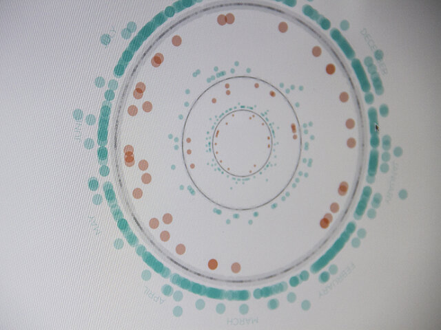
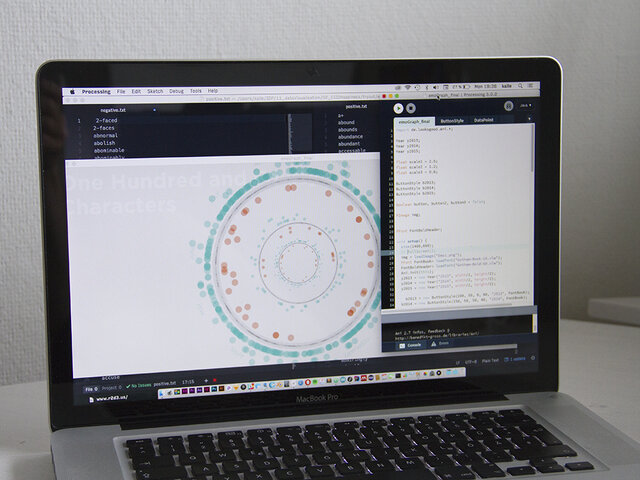
This data visualization is an exploration of the happiness of CIID’s IDP students during the one-year course.This visualisation uses a data set that was mined with the help of a web crawler. A sentiment analysis, done in Processing, separates the tweets into 7 categories of happiness.
It is worth mentioning that there is an irregularity in the end of every year, where the number of tweets drop significantly – probably because of high stress levels during the final sprint.


